How to Use Tall-Man Lettering to Reduce Medication Name Mix-Ups
Every year, thousands of medication errors happen because two drug names look or sound too similar. A nurse grabs prednisone instead of prednisolone. A pharmacist fills a prescription for hydrocodone but hands out hydromorphone. These aren’t hypothetical mistakes-they’re real, dangerous, and preventable. One of the simplest, most cost-effective tools to stop these mix-ups? Tall-man lettering.
What Is Tall-Man Lettering?
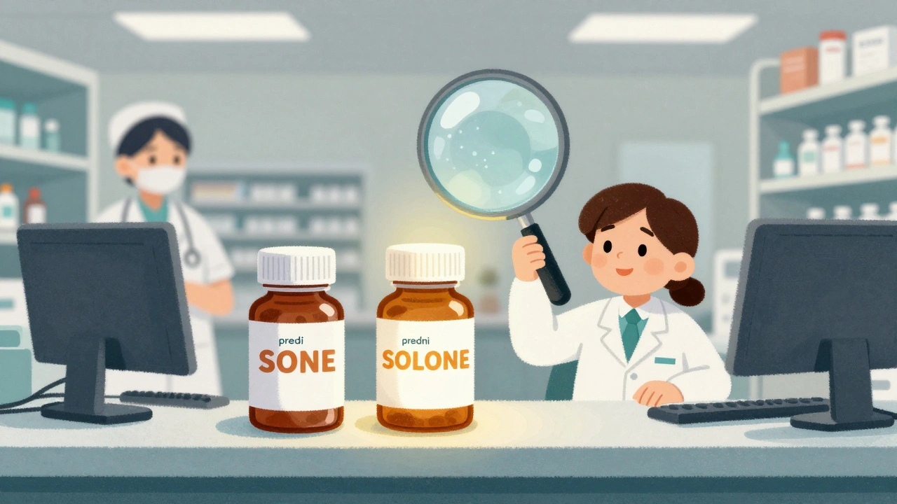
Tall-man lettering is a way of writing drug names with some letters in uppercase to highlight the key differences between look-alike, sound-alike (LASA) medications. It’s not about making the whole name bold or italic. It’s about making the part that matters stand out visually.For example:
- predniSONE vs. predniSOLONE
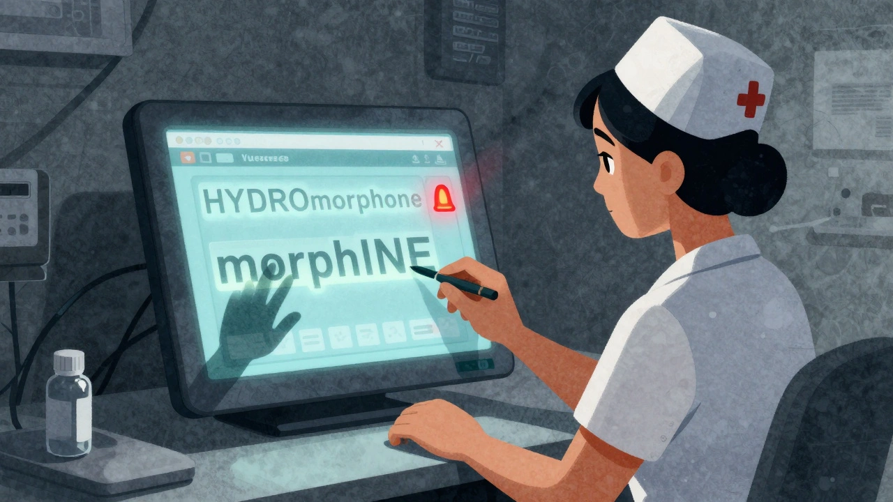
- HYDROmorphone vs. morphINE
- vinBLAStine vs. vinCRIStine
- CISplatin vs. CARBOplatin
The capitalized letters are the ones that differ. Your brain picks up on those uppercase chunks faster than it reads full words. In a busy ER or pharmacy, where staff are juggling dozens of orders, that visual cue can mean the difference between safety and a serious error.
The Institute for Safe Medication Practices (ISMP) introduced the idea in 1999. Since then, the U.S. Food and Drug Administration (FDA), Health Canada, Australia’s National Mixed-Case Lettering List, and other agencies have adopted it. As of 2023, 89% of U.S. hospitals use tall-man lettering in their electronic systems. It’s not optional anymore-it’s a standard part of medication safety protocols.
Why It Works: The Science Behind the Capital Letters
You might think, “Isn’t this just a fancy way of highlighting text?” But there’s real psychology behind it.In 2004, ISMP ran an eye-tracking study with nurses and pharmacists. They showed participants two drug names-one in standard lowercase, one with tall-man lettering. When names were written normally, people took an average of 2.3 seconds longer to spot the difference. With tall-man lettering, errors dropped by 35%.
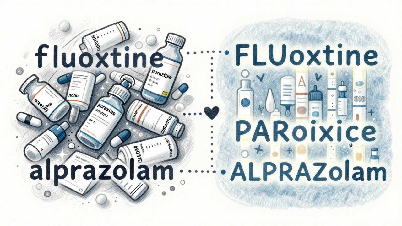
Why? Because our brains process visual patterns faster than text. When you see ALPRAZolam and LORazepam, the capitalized “ZOL” and “ZEP” act like signposts. You don’t have to read the whole word. Your eyes lock onto the uppercase section and recognize it as a unique identifier.
That’s especially helpful in high-pressure moments-like when a nurse is rushing to give a dose before surgery, or a pharmacist is filling 40 prescriptions in 10 minutes. Tall-man lettering reduces cognitive load. It doesn’t require extra training. It doesn’t need new equipment. It just makes the right choice easier to see.
Who Uses It and Where?
Tall-man lettering isn’t just on paper labels anymore. It’s embedded in the digital backbone of healthcare systems:- Electronic Health Records (EHRs) like Epic, Cerner, and Meditech
- Automated dispensing cabinets (Pyxis, Omnicell)
- Barcoding and scanning systems
- Prescription labels printed at the pharmacy
- Drug databases used by clinicians
When a doctor types “prednisone” into the EHR, the system auto-converts it to predniSONE. When a pharmacist pulls up the drug in the dispensing system, it appears the same way. Even the barcode on the bottle reflects the tall-man format.
This consistency matters. If one system writes FLUoxetine and another writes fluoxetine, the whole point is lost. That’s why major hospitals now require vendors to support standardized tall-man lettering in their software. The FDA maintains a list of 72 recommended drug pairs. ISMP’s list is longer-252 pairs-and updated quarterly. Australia uses 192 pairs. The goal? Harmonization.
In January 2023, the FDA and ISMP announced a joint effort to align their lists by mid-2024. That’s a big deal. Right now, confusion still happens because one hospital uses one format and the community pharmacy down the street uses another.
How to Implement It Correctly
If your facility doesn’t use tall-man lettering yet-or if it’s inconsistent-here’s how to fix it:- Form a safety team. Include pharmacists, nurses, IT staff, and a physician. Don’t let this be an IT-only project. Medication safety is a clinical one.
- Choose your reference list. Start with ISMP’s list-it’s the most comprehensive. Cross-check with your local health authority’s guidelines.
- Map your systems. List every place drug names appear: EHR, dispensing machines, printing systems, mobile apps. Each one needs to be updated.
- Test the font. Not all fonts render uppercase letters clearly. Use a clean, readable font like Arial or Helvetica. Avoid condensed or decorative fonts. Test on small screens and printed labels.
- Train staff. Don’t assume people understand why it’s there. Show them examples of errors that were prevented. Use real cases from your own facility.
- Monitor and adjust. Track how often LASA drug alerts are overridden. If errors don’t drop after six months, check if the capitalization is consistent across systems.
A 2022 study in a 500-bed hospital found implementation took about 16 weeks. The biggest hurdle? Legacy systems that don’t support custom capitalization. Many hospitals had to upgrade software or pay vendors for updates. But the cost? Around $1,200 per system in Australia. In the U.S., most EHRs include it as a built-in feature now.
What Doesn’t Work
Tall-man lettering isn’t magic. It has limits.First, it doesn’t help if the difference is at the start of the word. Try metoprolol and methyldopa. The first letters are different, but they’re both lowercase. Tall-man lettering can’t make “ME” stand out if it’s the beginning. In cases like this, you need other tools-like forced selection menus in EHRs.
Second, if the capitalization is inconsistent, it backfires. A nurse sees PARoxetine in the EHR but paroxetine on the bottle. That’s not safety-it’s confusion.
Third, it won’t fix bad handwriting, poor communication, or rushed workflows. Tall-man lettering is one layer in a defense-in-depth strategy. It works best with barcode scanning, double-checks, and clear communication protocols.
Some experts, like Dr. Robert Wachter, argue it gives a false sense of security. But Dr. Michael Cohen from ISMP puts it best: “It’s not a cure. It’s a seatbelt.” You still need to buckle up-but the belt helps if you crash.
Real Stories from the Front Lines
Pharmacist Maria Chen in Ohio told the ASHP forum: “After we implemented ISMP’s tall-man list in our Epic system, we saw a 42% drop in overridden LASA alerts in six months.”But not everyone’s experience is smooth. Dr. John Davies, a physician in a rural clinic, wrote on Reddit: “I mix up ALPRAZolam and LORazepam all the time. The font in our EHR is too small. The capital letters are barely visible.”
That’s the problem. If the design is bad, the tool fails. Font size, screen resolution, lighting, and print quality all matter. A 2023 survey found 63% of pharmacists reported inconsistent application across systems in their own hospital. That’s a red flag.
On the flip side, nurse practitioner Sarah Williams said in the American Journal of Nursing: “The capitalized ‘SONE’ in predniSONE immediately tells me it’s not predniSOLONE. I don’t have to pause and think. That saves time-and lives.”
The Future of Tall-Man Lettering
New tech is coming. Epic Systems is testing an AI version that adjusts capitalization based on real-time error data. If a certain drug pair keeps being confused, the system automatically tweaks the formatting to make the difference even clearer.But even with voice recognition, AI assistants, and robotic dispensers, tall-man lettering isn’t going away. Why? Because humans still make decisions. Screens still glitch. People still get tired. The visual cue remains one of the most reliable safety nets we have.
The Agency for Healthcare Research and Quality (AHRQ) predicts tall-man lettering will stay standard through 2030. ISMP says it will remain critical-even in fully automated systems.
Because sometimes, the simplest fix is the most powerful one.
Frequently Asked Questions
What is the main purpose of tall-man lettering?
The main purpose is to reduce medication errors caused by look-alike, sound-alike (LASA) drug names. By capitalizing the parts of the name that differ-like predniSONE vs. predniSOLONE-it creates a visual cue that helps healthcare workers quickly spot the correct medication, even in fast-paced or high-stress environments.
Which organizations recommend tall-man lettering?
The Institute for Safe Medication Practices (ISMP), the U.S. Food and Drug Administration (FDA), Health Canada, and Australia’s National Mixed-Case Lettering List all officially recommend tall-man lettering. The Joint Commission also requires it as part of its National Patient Safety Goal for differentiating similar drug names.
Is tall-man lettering effective in reducing actual patient harm?
Evidence shows it reduces selection errors by up to 35% in controlled studies. However, the Cochrane Collaboration rates the evidence for reducing actual patient harm as “low certainty.” That’s because harm depends on many factors-like whether the error was caught before administration. Tall-man lettering prevents the mistake from happening at the selection stage, which is the most common point of failure.
Can tall-man lettering be used for brand names too?
Yes. While most focus is on generic names, brand names like ZYRTEC and ZOLOFT are also included in tall-man lists when they’re easily confused. ISMP’s list includes 42 brand names alongside 168 active ingredients. Consistency matters-even for brand names.
Why do some hospitals still have inconsistent tall-man lettering?
Different vendors (Epic, Cerner, Meditech) sometimes use different capitalization rules. Community pharmacies may not follow hospital standards. Legacy systems can’t support custom formatting. Without a unified national standard, inconsistencies persist. The FDA and ISMP are working to fix this with a joint list expected in 2024.
Tall-man lettering is a simple but brilliant idea. In India, we see similar issues with drug names like atenoLOL and atenoSOL. The visual cue saves time and reduces errors, especially in rural clinics where staff are overworked. No need for expensive tech-just smart typography.
Yesss this is so needed!! I work in a pharmacy and we had a near-miss last month with clonidiNE and clonidiNINE. After we switched to tall-man, I actually breathe easier during rush hour. Thank you for sharing this!!
Finally someone talks about this! I’ve been pushing for this in our EHR for years. Our IT team thought it was ‘just formatting.’ Nope. It’s a safety feature. Now our nurses say they catch mistakes before they even click ‘administer.’
Why are we still using letters to fix human mistakes when we could just use barcodes or AI
There’s something deeply human about this solution. It doesn’t replace judgment-it enhances it. We’re not automating away the risk, we’re giving the human brain a better way to navigate it. That’s why it’s lasted 25 years. Technology changes, but the way we perceive patterns? That’s timeless. I’ve seen nurses pause mid-scan because the ‘SONE’ jumped out at them. That pause? That’s the moment safety happens.
The real win here isn’t just reducing errors-it’s reducing cognitive fatigue. Healthcare workers aren’t machines. We’re dealing with 15 patients, 3 emergencies, and a broken printer. When your brain is fried, you don’t need more complexity-you need clarity. Tall-man lettering is like giving your tired mind a flashlight in a dark hallway. It doesn’t solve everything, but it lights up the path where it matters most. And that’s enough.
Yet another ‘band-aid’ solution… we’re just papering over systemic failures with typography. Who designed these drug names in the first place? Why do we have 252 pairs that look identical? It’s not the capitalization that’s broken-it’s the entire pharmaceutical naming ecosystem. And now we’re asking nurses to become typographers? Brilliant.
i used to work in a hospital where they did this but the font was so small and the screen was glarey… i swear i saw fluoxeTINE as fluoxeTIN once… and i nearly gave it to a patient… it’s not foolproof…
Why are we letting foreign countries dictate our medical standards? Australia uses 192 pairs? Who cares? We have our own system. The FDA list is enough. This global harmonization nonsense is just bureaucratic overreach. We don’t need to copy Europe or Asia to be safe.
OMG YES!! I had a coworker almost give HYDROmorphone instead of HYDROcodone last week. The ‘MOR’ stood out like a neon sign. We all cried. Like, actual tears. This isn’t just a tool-it’s a lifesaver. 🙏
They’re not telling you the whole truth. Tall-man lettering is a distraction. The real issue? Pharma companies intentionally make names similar so hospitals have to buy their branded versions. This is a profit scheme disguised as safety. The FDA is in their pocket. Look up the lobbying records.
In India, we use tall-man for drugs like metoPROlol and methyLdopa, but our EHRs don’t support it properly. We print labels manually with bold markers. It’s messy, but it works. The concept is universal-even in low-resource settings.
Just saw this in our new Epic update. The ‘ZOL’ in ALPRAZolam is now bolded in a different shade of blue. I didn’t even realize it was a change until I caught myself reaching for the wrong bottle. Small thing. Huge impact. 👍
One thing people overlook: consistency across systems is everything. I’ve seen a nurse pull up a drug in Epic as PARoxetine, then grab the bottle from the cabinet labeled paroxetine. The capitalization mismatch created confusion, not clarity. It’s not enough to have the feature-you have to enforce it everywhere. Every printer, every screen, every label. No exceptions.
While the concept is theoretically sound, the empirical evidence remains underwhelming. The Cochrane Collaboration has explicitly flagged the low-certainty evidence regarding actual patient harm reduction. One must question whether this is a placebo safety measure, akin to placing red tape around IV lines. The psychological comfort derived from visual cues does not equate to clinical efficacy.